

Ff4 C4 C
About This Color Palette
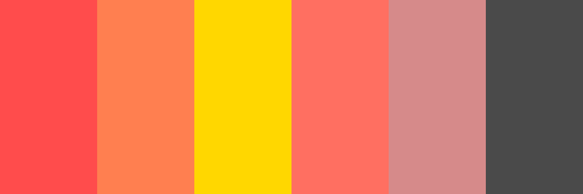
Here’s a color palette inspired by the vibrant shade of FF4C4C, which is a bright red. This palette includes complementary and analogous colors that harmonize well with the primary color while providing visual interest.

### Color Palette: "Fiery Harmony"

1. **Crimson Red**
   - **Hex Code:**

          #FF4C4C

   - **Description:** A bold and energetic shade of red that serves as the focal point of the palette. It evokes feelings of passion and excitement.

2. **Sunset Orange**
   - **Hex Code:**

          #FF7F50

   - **Description:** A warm, inviting orange that adds warmth and vibrancy, reminiscent of a sunset. It complements the red beautifully.

3. **Golden Yellow**
   - **Hex Code:**

          #FFD700

   - **Description:** A bright, cheerful yellow that brings brightness and optimism to the palette, creating a lively contrast with the red and orange.

4. **Soft Coral**
   - **Hex Code:**

          #FF6F61

   - **Description:** A gentle coral that provides a softer touch, balancing the intensity of the red while maintaining a warm undertone.

5. **Dusty Rose**
   - **Hex Code:**

          #D68A8A

   - **Description:** A muted pinkish hue that introduces a touch of elegance and sophistication, harmonizing with the bolder colors without overpowering them.

6. **Charcoal Gray**
   - **Hex Code:**

          #4A4A4A

   - **Description:** A deep gray that grounds the palette, providing contrast and a sense of stability. It serves as a canvas for the brighter colors to shine.

### Summary:
This palette, "Fiery Harmony," combines bold, vibrant tones with softer shades to create a dynamic and balanced visual experience. It is perfect for designs that aim to evoke energy and warmth while maintaining a sense of elegance.
Customize Preview Colors
Upgrade to ProOverview
Welcome back, here's what's happening today.
Revenue Growth
Build something amazing
Create stunning designs with our AI-powered color palette generator. Perfect for web, mobile, and print.
Fast Performance
Optimized for speed and efficiency.
Secure by Default
Enterprise-grade security built-in.
Easy to Use
Intuitive interface for everyone.
Good Morning
Here's your daily update
Today
Logo Variations
Business Card
John Doe
Creative Director
john.doe@brandname.com
+1 (555) 123-4567
www.brandname.com
Type Scale
Heading 1
Bold / 48pxHeading 2
Bold / 36pxHeading 3 Bold / 30px
Heading 4
Bold / 24pxBody text. Lorem ipsum dolor sit amet, consectetur adipiscing elit. Sed do eiusmod tempor incididunt ut labore et dolore magna aliqua.
Regular / 16pxArticle Layout
The Future of Color
Color trends are evolving rapidly. We are seeing a shift towards more vibrant, expressive palettes that capture attention and evoke emotion.
"Color is a power which directly influences the soul."
Why it matters
Choosing the right color palette is crucial for brand identity. It communicates values without words and creates an instant connection with the audience.
Abstract
Composition #01
Download Files
Copy Code
Simulate how your palette appears to users with different types of color vision deficiencies. Approximately 8% of men and 0.5% of women have some form of color blindness.
Original Palette
Protanopia
Red-blind (approx. 1% of men)
Deuteranopia
Green-blind (approx. 1% of men)
Tritanopia
Blue-blind (very rare)
Achromatopsia
Total color blindness (monochromacy)
Shades & Tints
Explore lighter variations (tints) and darker variations (shades) of each color. Click any color to copy its hex code.
Blood Burst
#FF4C4C
Tints
(Mixed with white - lighter)Original
Shades
(Mixed with black - darker)Coral
#FF7F50
Tints
(Mixed with white - lighter)Original
Shades
(Mixed with black - darker)Gold
#FFD700
Tints
(Mixed with white - lighter)Original
Shades
(Mixed with black - darker)Pastel Red
#FF6F61
Tints
(Mixed with white - lighter)Original
Shades
(Mixed with black - darker)Peaches of Immortality
#D68A8A
Tints
(Mixed with white - lighter)Original
Shades
(Mixed with black - darker)Shady Character
#4A4A4A
Tints
(Mixed with white - lighter)Original
Shades
(Mixed with black - darker)Color Theory Analysis
Unlock advanced color wheel distribution, harmony detection, and HSL color analysis with Pro.
Upgrade to ProColor Wheel Distribution
Harmony Analysis
Dominant Temperature
--
Harmony Type
--
Analyzing color relationships...
Color Values (HSL)
Select Background
Select Text Color
Contrast Analysis
Aa
The quick brown fox jumps over the lazy dog.
Normal Text
Large Text
Understanding WCAG Scores
Normal Text
- AA requires 4.5:1 ratio
- AAA requires 7.0:1 ratio
Large Text (18pt+ or 14pt+ bold)
- AA requires 3.0:1 ratio
- AAA requires 4.5:1 ratio