

Designs
About This Color Palette
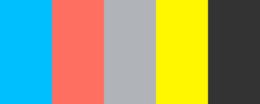
Based on the query “Designs,” I have created a versatile and modern color palette suitable for various design projects. This palette features a blend of vibrant and neutral tones that can be applied to both digital and print designs.
 <Designs>
1. Aqua Blue -

          #00BFFF
        - A bright and refreshing shade that evokes a sense of tranquility and creativity.
2. Coral Pink -

          #FF6F61
        - A warm and inviting hue that adds a touch of playfulness to any design.
3. Soft Gray -

          #B0B3B8
        - A neutral tone that provides balance and sophistication, making other colors pop.
4. Lemon Yellow -

          #FFF700
        - An energetic and cheerful color that brings a sense of optimism and brightness to the palette.
5. Charcoal Black -

          #333333
        - A deep and bold shade that adds depth and contrast, grounding the palette effectively.
This color palette can be utilized for branding, website design, or any creative project where a modern touch is desired.
What type of designs are you focusing on? Are there specific emotions or themes you want to convey with these designs?
Customize Preview Colors
Upgrade to ProOverview
Welcome back, here's what's happening today.
Revenue Growth
Build something amazing
Create stunning designs with our AI-powered color palette generator. Perfect for web, mobile, and print.
Fast Performance
Optimized for speed and efficiency.
Secure by Default
Enterprise-grade security built-in.
Easy to Use
Intuitive interface for everyone.
Good Morning
Here's your daily update
Today
Logo Variations
Business Card
John Doe
Creative Director
john.doe@brandname.com
+1 (555) 123-4567
www.brandname.com
Type Scale
Heading 1
Bold / 48pxHeading 2
Bold / 36pxHeading 3 Bold / 30px
Heading 4
Bold / 24pxBody text. Lorem ipsum dolor sit amet, consectetur adipiscing elit. Sed do eiusmod tempor incididunt ut labore et dolore magna aliqua.
Regular / 16pxArticle Layout
The Future of Color
Color trends are evolving rapidly. We are seeing a shift towards more vibrant, expressive palettes that capture attention and evoke emotion.
"Color is a power which directly influences the soul."
Why it matters
Choosing the right color palette is crucial for brand identity. It communicates values without words and creates an instant connection with the audience.
Abstract
Composition #01
Download Files
Copy Code
Simulate how your palette appears to users with different types of color vision deficiencies. Approximately 8% of men and 0.5% of women have some form of color blindness.
Original Palette
Protanopia
Red-blind (approx. 1% of men)
Deuteranopia
Green-blind (approx. 1% of men)
Tritanopia
Blue-blind (very rare)
Achromatopsia
Total color blindness (monochromacy)
Shades & Tints
Explore lighter variations (tints) and darker variations (shades) of each color. Click any color to copy its hex code.
Aqua Blue
#00BFFF
Tints
(Mixed with white - lighter)Original
Shades
(Mixed with black - darker)Coral Pink
#FF6F61
Tints
(Mixed with white - lighter)Original
Shades
(Mixed with black - darker)Soft Gray
#B0B3B8
Tints
(Mixed with white - lighter)Original
Shades
(Mixed with black - darker)Lemon Yellow
#FFF700
Tints
(Mixed with white - lighter)Original
Shades
(Mixed with black - darker)Charcoal Black
#333333
Tints
(Mixed with white - lighter)Original
Shades
(Mixed with black - darker)Color Theory Analysis
Unlock advanced color wheel distribution, harmony detection, and HSL color analysis with Pro.
Upgrade to ProColor Wheel Distribution
Harmony Analysis
Dominant Temperature
--
Harmony Type
--
Analyzing color relationships...
Color Values (HSL)
Select Background
Select Text Color
Contrast Analysis
Aa
The quick brown fox jumps over the lazy dog.
Normal Text
Large Text
Understanding WCAG Scores
Normal Text
- AA requires 4.5:1 ratio
- AAA requires 7.0:1 ratio
Large Text (18pt+ or 14pt+ bold)
- AA requires 3.0:1 ratio
- AAA requires 4.5:1 ratio