

Warm Autumn
About This Color Palette
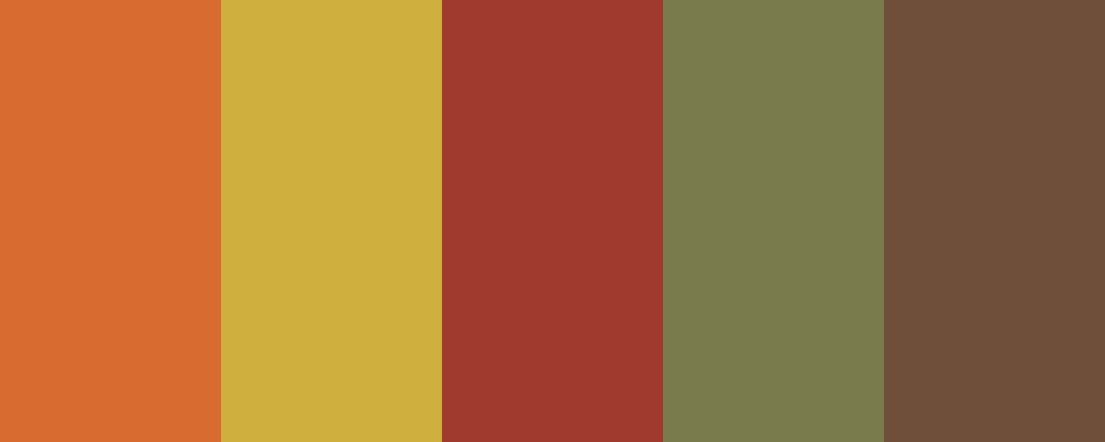
 <Warm Autumn>
1. Ember Orange -

          #D76B30
        - A rich, warm orange reminiscent of falling leaves.
2. Golden Maple -

          #CFAF3E
        - A soft golden hue that reflects the warmth of autumn sunlight.
3. Rustic Red -

          #A03A2E
        - A deep, earthy red that evokes the feeling of cozy firesides.
4. Olive Green -

          #7A7B4D
        - A muted green that adds a touch of nature's tranquility.
5. Chestnut Brown -

          #6F4F3A
        - A warm, inviting brown that grounds the palette.
This color palette captures the essence of a warm autumn, combining rich oranges, soft golds, earthy reds, muted greens, and inviting browns. It’s perfect for creating a cozy, inviting atmosphere.
What type of project are you working on that requires this color palette?
Customize Preview Colors
Upgrade to ProOverview
Welcome back, here's what's happening today.
Revenue Growth
Build something amazing
Create stunning designs with our AI-powered color palette generator. Perfect for web, mobile, and print.
Fast Performance
Optimized for speed and efficiency.
Secure by Default
Enterprise-grade security built-in.
Easy to Use
Intuitive interface for everyone.
Good Morning
Here's your daily update
Today
Logo Variations
Business Card
John Doe
Creative Director
john.doe@brandname.com
+1 (555) 123-4567
www.brandname.com
Type Scale
Heading 1
Bold / 48pxHeading 2
Bold / 36pxHeading 3 Bold / 30px
Heading 4
Bold / 24pxBody text. Lorem ipsum dolor sit amet, consectetur adipiscing elit. Sed do eiusmod tempor incididunt ut labore et dolore magna aliqua.
Regular / 16pxArticle Layout
The Future of Color
Color trends are evolving rapidly. We are seeing a shift towards more vibrant, expressive palettes that capture attention and evoke emotion.
"Color is a power which directly influences the soul."
Why it matters
Choosing the right color palette is crucial for brand identity. It communicates values without words and creates an instant connection with the audience.
Abstract
Composition #01
Download Files
Copy Code
Simulate how your palette appears to users with different types of color vision deficiencies. Approximately 8% of men and 0.5% of women have some form of color blindness.
Original Palette
Protanopia
Red-blind (approx. 1% of men)
Deuteranopia
Green-blind (approx. 1% of men)
Tritanopia
Blue-blind (very rare)
Achromatopsia
Total color blindness (monochromacy)
Shades & Tints
Explore lighter variations (tints) and darker variations (shades) of each color. Click any color to copy its hex code.
Ember Orange
#D76B30
Tints
(Mixed with white - lighter)Original
Shades
(Mixed with black - darker)Golden Maple
#CFAF3E
Tints
(Mixed with white - lighter)Original
Shades
(Mixed with black - darker)Rustic Red
#A03A2E
Tints
(Mixed with white - lighter)Original
Shades
(Mixed with black - darker)Olive Green
#7A7B4D
Tints
(Mixed with white - lighter)Original
Shades
(Mixed with black - darker)Chestnut Brown
#6F4F3A
Tints
(Mixed with white - lighter)Original
Shades
(Mixed with black - darker)Color Theory Analysis
Unlock advanced color wheel distribution, harmony detection, and HSL color analysis with Pro.
Upgrade to ProColor Wheel Distribution
Harmony Analysis
Dominant Temperature
--
Harmony Type
--
Analyzing color relationships...
Color Values (HSL)
Select Background
Select Text Color
Contrast Analysis
Aa
The quick brown fox jumps over the lazy dog.
Normal Text
Large Text
Understanding WCAG Scores
Normal Text
- AA requires 4.5:1 ratio
- AAA requires 7.0:1 ratio
Large Text (18pt+ or 14pt+ bold)
- AA requires 3.0:1 ratio
- AAA requires 4.5:1 ratio