

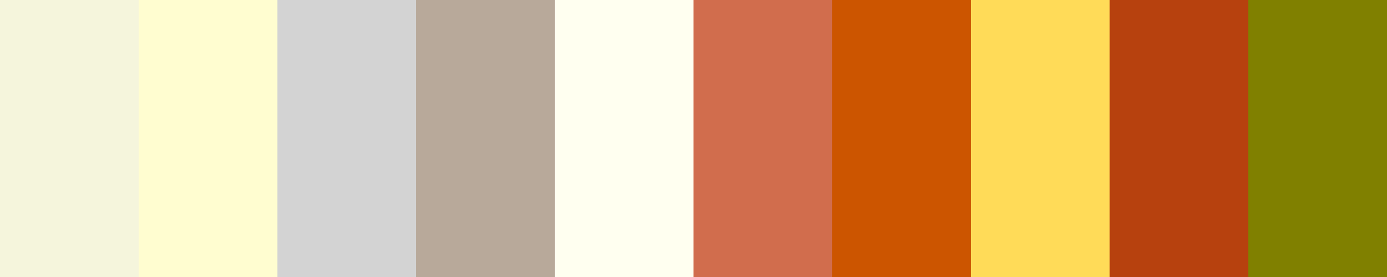
Neutral And Warm Tones
About This Color Palette
 <Neutral and Warm Tones>
1. Light Beige -

                            #F5F5DC
                         - A soft, warm neutral that creates a calming backdrop.
2. Cream -

                            #FFFDD0
                         - A warm off-white that adds brightness without being harsh.
3. Soft Gray -

                            #D3D3D3
                         - A soothing light gray that pairs well with both warm and neutral tones.
4. Taupe -

                            #B8A99A
                         - A muted brownish-gray that brings depth and sophistication.
5. Ivory -

                            #FFFFF0
                         - A warm, classic shade that exudes elegance and simplicity.
6. Warm Terracotta -

                            #D16D4D
                         - A rich, earthy tone that adds warmth and vibrancy.
7. Burnt Orange -

                            #CC5500
                         - A bold, warm color that energizes the palette.
8. Mustard Yellow -

                            #FFDB58
                         - A warm, cheerful yellow that brings brightness and optimism.
9. Rust -

                            #B7410E
                         - A deep, warm reddish-brown that evokes a sense of groundedness.
10. Warm Olive Green -

                            #808000
                         - An earthy green that adds a natural, organic feel.
This color palette blends neutral tones, providing a calming and sophisticated base, with warm tones that bring energy and vibrancy. The combination is versatile, suitable for a variety of design applications, from home decor to branding.
Would you like to know more about how to use these colors effectively in your design project? Or do you have a specific application in mind for this palette?
Overview
Welcome back, here's what's happening today.
Revenue Growth
Build something amazing
Create stunning designs with our AI-powered color palette generator. Perfect for web, mobile, and print.
Fast Performance
Optimized for speed and efficiency.
Secure by Default
Enterprise-grade security built-in.
Easy to Use
Intuitive interface for everyone.
Good Morning
Here's your daily update
Today
Logo Variations
Business Card
John Doe
Creative Director
john.doe@brandname.com
+1 (555) 123-4567
www.brandname.com
Type Scale
Heading 1
Bold / 48pxHeading 2
Bold / 36pxHeading 3
Bold / 30pxHeading 4
Bold / 24pxBody text. Lorem ipsum dolor sit amet, consectetur adipiscing elit. Sed do eiusmod tempor incididunt ut labore et dolore magna aliqua.
Regular / 16pxArticle Layout
The Future of Color
Color trends are evolving rapidly. We are seeing a shift towards more vibrant, expressive palettes that capture attention and evoke emotion.
"Color is a power which directly influences the soul."
Why it matters
Choosing the right color palette is crucial for brand identity. It communicates values without words and creates an instant connection with the audience.
Abstract
Composition #01
Download Files
Copy Code
Simulate how your palette appears to users with different types of color vision deficiencies. Approximately 8% of men and 0.5% of women have some form of color blindness.
Original Palette
Protanopia
Red-blind (approx. 1% of men)
Deuteranopia
Green-blind (approx. 1% of men)
Tritanopia
Blue-blind (very rare)
Achromatopsia
Total color blindness (monochromacy)
Shades & Tints
Explore lighter variations (tints) and darker variations (shades) of each color. Click any color to copy its hex code.
Light Beige
#F5F5DC
Tints
(Mixed with white - lighter)Original
Shades
(Mixed with black - darker)Cream
#FFFDD0
Tints
(Mixed with white - lighter)Original
Shades
(Mixed with black - darker)Soft Gray
#D3D3D3
Tints
(Mixed with white - lighter)Original
Shades
(Mixed with black - darker)Taupe
#B8A99A
Tints
(Mixed with white - lighter)Original
Shades
(Mixed with black - darker)Ivory
#FFFFF0
Tints
(Mixed with white - lighter)Original
Shades
(Mixed with black - darker)Warm Terracotta
#D16D4D
Tints
(Mixed with white - lighter)Original
Shades
(Mixed with black - darker)Burnt Orange
#CC5500
Tints
(Mixed with white - lighter)Original
Shades
(Mixed with black - darker)Mustard Yellow
#FFDB58
Tints
(Mixed with white - lighter)Original
Shades
(Mixed with black - darker)Rust
#B7410E
Tints
(Mixed with white - lighter)Original
Shades
(Mixed with black - darker)Heart Gold
#808000
Tints
(Mixed with white - lighter)Original
Shades
(Mixed with black - darker)Color Wheel Distribution
Harmony Analysis
Dominant Temperature
--
Harmony Type
--
Analyzing color relationships...
Color Values (HSL)
Select Background
Select Text Color
Contrast Analysis
Aa
The quick brown fox jumps over the lazy dog.
Normal Text
Large Text
Understanding WCAG Scores
Normal Text
- AA requires 4.5:1 ratio
- AAA requires 7.0:1 ratio
Large Text (18pt+ or 14pt+ bold)
- AA requires 3.0:1 ratio
- AAA requires 4.5:1 ratio