

Радісний настрій
About This Color Palette
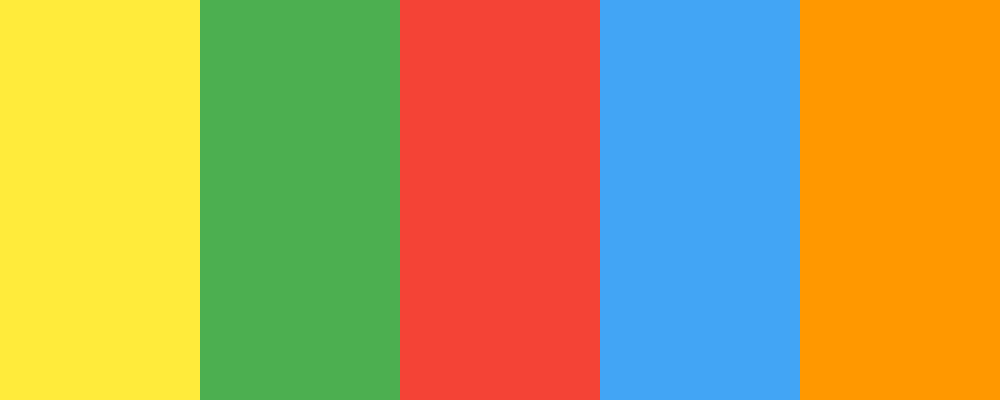
Ось палітра кольорів, що відображає радісний та жвавий настрій пісні “Ой на горі та й женці жнуть”. Ця палітра включає яскраві, живі кольори, які символізують енергію, радість і природну красу.
json
{
  "palette_name": "Радісний настрій",
  "colors": [
    {
      "name": "Сонячний жовтий",
      "hex_code": "

                            #FFEB3B
                        "
    },
    {
      "name": "Соковитий зелений",
      "hex_code": "

                            #4CAF50
                        "
    },
    {
      "name": "Яскравий червоний",
      "hex_code": "

                            #F44336
                        "
    },
    {
      "name": "Блакитне небо",
      "hex_code": "

                            #42A5F5
                        "
    },
    {
      "name": "Помаранчевий",
      "hex_code": "

                            #FF9800
                        "
    }
  ]
}
Опис палітри:
Ця палітра насичена яскравими кольорами. Сонячний жовтий символізує тепло та радість, соковитий зелений - життя та свіжість, яскравий червоний - емоції та силу, блакитне небо - простір та свободу, а помаранчевий - енергію та оптимізм. Всі ці кольори разом створюють настрій свята та єдності.
Чи є ще якісь елементи або кольори, які ви хотіли б додати до цієї палітри?
Overview
Welcome back, here's what's happening today.
Revenue Growth
Build something amazing
Create stunning designs with our AI-powered color palette generator. Perfect for web, mobile, and print.
Fast Performance
Optimized for speed and efficiency.
Secure by Default
Enterprise-grade security built-in.
Easy to Use
Intuitive interface for everyone.
Good Morning
Here's your daily update
Today
Logo Variations
Business Card
John Doe
Creative Director
john.doe@brandname.com
+1 (555) 123-4567
www.brandname.com
Type Scale
Heading 1
Bold / 48pxHeading 2
Bold / 36pxHeading 3
Bold / 30pxHeading 4
Bold / 24pxBody text. Lorem ipsum dolor sit amet, consectetur adipiscing elit. Sed do eiusmod tempor incididunt ut labore et dolore magna aliqua.
Regular / 16pxArticle Layout
The Future of Color
Color trends are evolving rapidly. We are seeing a shift towards more vibrant, expressive palettes that capture attention and evoke emotion.
"Color is a power which directly influences the soul."
Why it matters
Choosing the right color palette is crucial for brand identity. It communicates values without words and creates an instant connection with the audience.
Abstract
Composition #01
Download Files
Copy Code
Simulate how your palette appears to users with different types of color vision deficiencies. Approximately 8% of men and 0.5% of women have some form of color blindness.
Original Palette
Protanopia
Red-blind (approx. 1% of men)
Deuteranopia
Green-blind (approx. 1% of men)
Tritanopia
Blue-blind (very rare)
Achromatopsia
Total color blindness (monochromacy)
Shades & Tints
Explore lighter variations (tints) and darker variations (shades) of each color. Click any color to copy its hex code.
Сонячний жовтий
#FFEB3B
Tints
(Mixed with white - lighter)Original
Shades
(Mixed with black - darker)Соковитий зелений
#4CAF50
Tints
(Mixed with white - lighter)Original
Shades
(Mixed with black - darker)Яскравий червоний
#F44336
Tints
(Mixed with white - lighter)Original
Shades
(Mixed with black - darker)Блакитне небо
#42A5F5
Tints
(Mixed with white - lighter)Original
Shades
(Mixed with black - darker)Помаранчевий
#FF9800
Tints
(Mixed with white - lighter)Original
Shades
(Mixed with black - darker)Color Wheel Distribution
Harmony Analysis
Dominant Temperature
--
Harmony Type
--
Analyzing color relationships...
Color Values (HSL)
Select Background
Select Text Color
Contrast Analysis
Aa
The quick brown fox jumps over the lazy dog.
Normal Text
Large Text
Understanding WCAG Scores
Normal Text
- AA requires 4.5:1 ratio
- AAA requires 7.0:1 ratio
Large Text (18pt+ or 14pt+ bold)
- AA requires 3.0:1 ratio
- AAA requires 4.5:1 ratio