

Ліцей №2
About This Color Palette
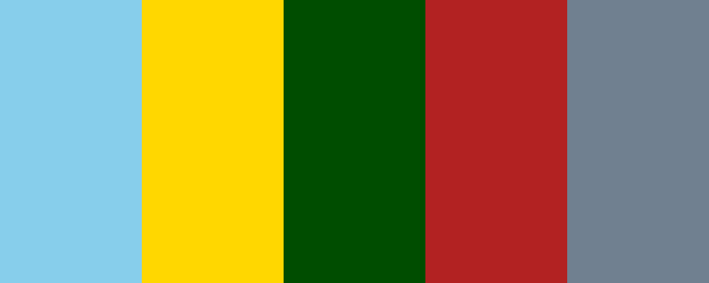
Ось значення кольорів у створеній палітрі “Ліцей №2”:
-
Sky Blue ( #87CEEB ) - цей колір символізує спокій, ясність та відкритість. Він створює атмосферу довіри та свободи, що є важливими аспектами в навчальному середовищі.
-
Golden Yellow ( #FFD700 ) - золотистий жовтий колір уособлює радість, оптимізм і енергію. Він може надихати учнів на нові досягнення і навчання.
-
Deep Green ( #004d00 ) - темно-зелений колір асоціюється з природою, зростанням і стабільністю. Він може допомогти створити відчуття заспокоєння і балансу в учбовому процесі.
-
Brick Red ( #B22222 ) - червоно-цегляний колір символізує силу, рішучість і пристрасть. Він може бути використаний для підкреслення важливості навчання та досягнень.
-
Slate Gray ( #708090 ) - сланцевий сірий колір втілює професіоналізм і елегантність. Він може стати основою для серйозного та зосередженого навчального середовища.
Якщо ви хочете дізнатися більше про конкретні кольори або їх використання, дайте знати!
Overview
Welcome back, here's what's happening today.
Revenue Growth
Build something amazing
Create stunning designs with our AI-powered color palette generator. Perfect for web, mobile, and print.
Fast Performance
Optimized for speed and efficiency.
Secure by Default
Enterprise-grade security built-in.
Easy to Use
Intuitive interface for everyone.
Good Morning
Here's your daily update
Today
Logo Variations
Business Card
John Doe
Creative Director
john.doe@brandname.com
+1 (555) 123-4567
www.brandname.com
Type Scale
Heading 1
Bold / 48pxHeading 2
Bold / 36pxHeading 3
Bold / 30pxHeading 4
Bold / 24pxBody text. Lorem ipsum dolor sit amet, consectetur adipiscing elit. Sed do eiusmod tempor incididunt ut labore et dolore magna aliqua.
Regular / 16pxArticle Layout
The Future of Color
Color trends are evolving rapidly. We are seeing a shift towards more vibrant, expressive palettes that capture attention and evoke emotion.
"Color is a power which directly influences the soul."
Why it matters
Choosing the right color palette is crucial for brand identity. It communicates values without words and creates an instant connection with the audience.
Abstract
Composition #01
Download Files
Copy Code
Simulate how your palette appears to users with different types of color vision deficiencies. Approximately 8% of men and 0.5% of women have some form of color blindness.
Original Palette
Protanopia
Red-blind (approx. 1% of men)
Deuteranopia
Green-blind (approx. 1% of men)
Tritanopia
Blue-blind (very rare)
Achromatopsia
Total color blindness (monochromacy)
Shades & Tints
Explore lighter variations (tints) and darker variations (shades) of each color. Click any color to copy its hex code.
Below Zero
#87CEEB
Tints
(Mixed with white - lighter)Original
Shades
(Mixed with black - darker)Gold
#FFD700
Tints
(Mixed with white - lighter)Original
Shades
(Mixed with black - darker)Forest
#004d00
Tints
(Mixed with white - lighter)Original
Shades
(Mixed with black - darker)Scarlet Blaze
#B22222
Tints
(Mixed with white - lighter)Original
Shades
(Mixed with black - darker)Chain Gang Grey
#708090
Tints
(Mixed with white - lighter)Original
Shades
(Mixed with black - darker)Color Wheel Distribution
Harmony Analysis
Dominant Temperature
--
Harmony Type
--
Analyzing color relationships...
Color Values (HSL)
Select Background
Select Text Color
Contrast Analysis
Aa
The quick brown fox jumps over the lazy dog.
Normal Text
Large Text
Understanding WCAG Scores
Normal Text
- AA requires 4.5:1 ratio
- AAA requires 7.0:1 ratio
Large Text (18pt+ or 14pt+ bold)
- AA requires 3.0:1 ratio
- AAA requires 4.5:1 ratio