

Мені тринадцятий минало
About This Color Palette
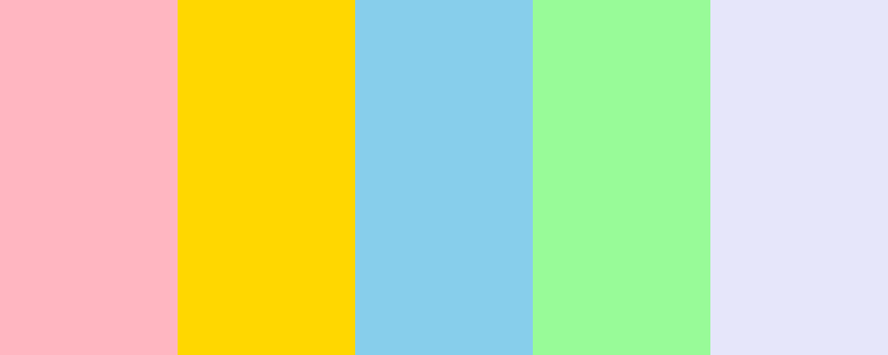
Ось значення кожного кольору з палітри “Спогади”:
-
Ніжно-рожевий ( #FFB6C1 ): Цей колір асоціюється з ніжністю, любов’ю і теплом. Він може викликати відчуття комфорту і захищеності, підкреслюючи романтичні та емоційні моменти.
-
Сонячно-жовтий ( #FFD700 ): Жовтий колір символізує радість, оптимізм і енергію. Він нагадує про сонячні дні та щасливі спогади, приносить позитивний настрій.
-
Небесно-блакитний ( #87CEEB ): Цей колір асоціюється з спокоєм, свободою і безмежністю. Він нагадує про ясне небо і спокійні води, викликаючи відчуття умиротворення і ясності.
-
М’ятний зелений ( #98FB98 ): М’ятний зелений символізує свіжість, відновлення і зростання. Цей колір викликає відчуття гармонії з природою і спокою, що може нагадувати про нові починання.
-
Лавандовий ( #E6E6FA ): Лавандовий колір асоціюється з миром, спокоєм і духовністю. Він часто використовується для створення затишної та релаксуючої атмосфери, що може викликати спогади про спокійні моменти.
Якщо у вас є ще питання або ви хочете дізнатися більше про певні кольори, дайте знати!
Overview
Welcome back, here's what's happening today.
Revenue Growth
Build something amazing
Create stunning designs with our AI-powered color palette generator. Perfect for web, mobile, and print.
Fast Performance
Optimized for speed and efficiency.
Secure by Default
Enterprise-grade security built-in.
Easy to Use
Intuitive interface for everyone.
Good Morning
Here's your daily update
Today
Logo Variations
Business Card
John Doe
Creative Director
john.doe@brandname.com
+1 (555) 123-4567
www.brandname.com
Type Scale
Heading 1
Bold / 48pxHeading 2
Bold / 36pxHeading 3
Bold / 30pxHeading 4
Bold / 24pxBody text. Lorem ipsum dolor sit amet, consectetur adipiscing elit. Sed do eiusmod tempor incididunt ut labore et dolore magna aliqua.
Regular / 16pxArticle Layout
The Future of Color
Color trends are evolving rapidly. We are seeing a shift towards more vibrant, expressive palettes that capture attention and evoke emotion.
"Color is a power which directly influences the soul."
Why it matters
Choosing the right color palette is crucial for brand identity. It communicates values without words and creates an instant connection with the audience.
Abstract
Composition #01
Download Files
Copy Code
Simulate how your palette appears to users with different types of color vision deficiencies. Approximately 8% of men and 0.5% of women have some form of color blindness.
Original Palette
Protanopia
Red-blind (approx. 1% of men)
Deuteranopia
Green-blind (approx. 1% of men)
Tritanopia
Blue-blind (very rare)
Achromatopsia
Total color blindness (monochromacy)
Shades & Tints
Explore lighter variations (tints) and darker variations (shades) of each color. Click any color to copy its hex code.
Matt Pink
#FFB6C1
Tints
(Mixed with white - lighter)Original
Shades
(Mixed with black - darker)Gold
#FFD700
Tints
(Mixed with white - lighter)Original
Shades
(Mixed with black - darker)Below Zero
#87CEEB
Tints
(Mixed with white - lighter)Original
Shades
(Mixed with black - darker)Toxic Frog
#98FB98
Tints
(Mixed with white - lighter)Original
Shades
(Mixed with black - darker)Foundation White
#E6E6FA
Tints
(Mixed with white - lighter)Original
Shades
(Mixed with black - darker)Color Wheel Distribution
Harmony Analysis
Dominant Temperature
--
Harmony Type
--
Analyzing color relationships...
Color Values (HSL)
Select Background
Select Text Color
Contrast Analysis
Aa
The quick brown fox jumps over the lazy dog.
Normal Text
Large Text
Understanding WCAG Scores
Normal Text
- AA requires 4.5:1 ratio
- AAA requires 7.0:1 ratio
Large Text (18pt+ or 14pt+ bold)
- AA requires 3.0:1 ratio
- AAA requires 4.5:1 ratio