

Nick And Charlie Connection
About This Color Palette
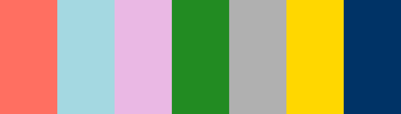
Here’s a color palette that embodies the essence of Nick and Charlie from “Heartstopper,” capturing their personalities, relationship, and the journey they share.
json
{
  "palette_name": "Nick and Charlie Connection",
  "colors": [
    {
      "name": "Warm Coral",
      "hex_code": "

          #FF6F61
       "
    },
    {
      "name": "Soft Sky",
      "hex_code": "

          #A4D8E1
       "
    },
    {
      "name": "Gentle Lavender",
      "hex_code": "

          #EAB8E4
       "
    },
    {
      "name": "Forest Green",
      "hex_code": "

          #228B22
       "
    },
    {
      "name": "Cool Gray",
      "hex_code": "

          #B0B0B0
       "
    },
    {
      "name": "Bright Yellow",
      "hex_code": "

          #FFD700
       "
    },
    {
      "name": "Deep Blue",
      "hex_code": "

          #003366
       "
    }
  ]
}
This palette reflects Nick’s warmth and strength with coral and green, while also capturing Charlie’s gentle and thoughtful nature with soft sky and lavender shades. The bright yellow adds a touch of joy and optimism, symbolizing their blossoming relationship, while the deep blue represents the depth of their emotions.
What do you think of this representation? Would you like to modify any colors or explore other aspects of their characters?
Customize Preview Colors
Upgrade to ProOverview
Welcome back, here's what's happening today.
Revenue Growth
Build something amazing
Create stunning designs with our AI-powered color palette generator. Perfect for web, mobile, and print.
Fast Performance
Optimized for speed and efficiency.
Secure by Default
Enterprise-grade security built-in.
Easy to Use
Intuitive interface for everyone.
Good Morning
Here's your daily update
Today
Logo Variations
Business Card
John Doe
Creative Director
john.doe@brandname.com
+1 (555) 123-4567
www.brandname.com
Type Scale
Heading 1
Bold / 48pxHeading 2
Bold / 36pxHeading 3 Bold / 30px
Heading 4
Bold / 24pxBody text. Lorem ipsum dolor sit amet, consectetur adipiscing elit. Sed do eiusmod tempor incididunt ut labore et dolore magna aliqua.
Regular / 16pxArticle Layout
The Future of Color
Color trends are evolving rapidly. We are seeing a shift towards more vibrant, expressive palettes that capture attention and evoke emotion.
"Color is a power which directly influences the soul."
Why it matters
Choosing the right color palette is crucial for brand identity. It communicates values without words and creates an instant connection with the audience.
Abstract
Composition #01
Download Files
Copy Code
Simulate how your palette appears to users with different types of color vision deficiencies. Approximately 8% of men and 0.5% of women have some form of color blindness.
Original Palette
Protanopia
Red-blind (approx. 1% of men)
Deuteranopia
Green-blind (approx. 1% of men)
Tritanopia
Blue-blind (very rare)
Achromatopsia
Total color blindness (monochromacy)
Shades & Tints
Explore lighter variations (tints) and darker variations (shades) of each color. Click any color to copy its hex code.
Warm Coral
#FF6F61
Tints
(Mixed with white - lighter)Original
Shades
(Mixed with black - darker)Soft Sky
#A4D8E1
Tints
(Mixed with white - lighter)Original
Shades
(Mixed with black - darker)Gentle Lavender
#EAB8E4
Tints
(Mixed with white - lighter)Original
Shades
(Mixed with black - darker)Forest Green
#228B22
Tints
(Mixed with white - lighter)Original
Shades
(Mixed with black - darker)Cool Gray
#B0B0B0
Tints
(Mixed with white - lighter)Original
Shades
(Mixed with black - darker)Bright Yellow
#FFD700
Tints
(Mixed with white - lighter)Original
Shades
(Mixed with black - darker)Deep Blue
#003366
Tints
(Mixed with white - lighter)Original
Shades
(Mixed with black - darker)Color Theory Analysis
Unlock advanced color wheel distribution, harmony detection, and HSL color analysis with Pro.
Upgrade to ProColor Wheel Distribution
Harmony Analysis
Dominant Temperature
--
Harmony Type
--
Analyzing color relationships...
Color Values (HSL)
Select Background
Select Text Color
Contrast Analysis
Aa
The quick brown fox jumps over the lazy dog.
Normal Text
Large Text
Understanding WCAG Scores
Normal Text
- AA requires 4.5:1 ratio
- AAA requires 7.0:1 ratio
Large Text (18pt+ or 14pt+ bold)
- AA requires 3.0:1 ratio
- AAA requires 4.5:1 ratio