

Покров
About This Color Palette
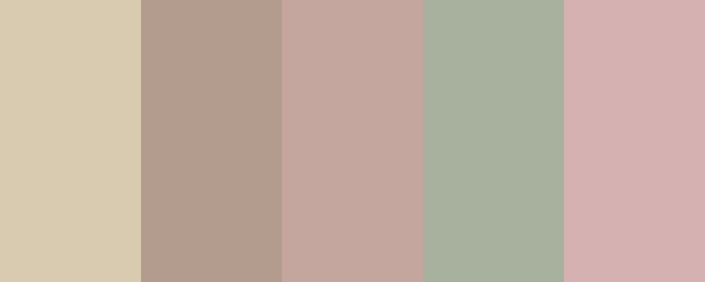
Мій вибір кольорової палітри “Покров” базується на емоціях і асоціаціях, які викликають ці кольори. Кожен з них був обраний для створення відчуття тепла, затишку та захисту, що відповідає значенню слова “покров”. Ось детальніше обґрунтування:
-
Soft Beige ( #D8CBAF ) - цей м’який бежевий колір символізує тепло та комфорт, нагадуючи про природні матеріали, такі як дерево та пісок.
-
Warm Taupe ( #B39C8E ) - теплий та нейтральний, цей колір додає відчуття стабільності і підтримки, що важливо для відчуття захисту.
-
Gentle Olive ( #A7B19D ) - оливковий колір асоціюється з природою та спокоєм. Він може викликати відчуття безпеки та гармонії.
-
Muted Clay ( #C4A69F ) - глиняний відтінок надає природного вигляду та тепла, нагадуючи про землю і природні елементи, що створюють відчуття укриття.
-
Dusty Rose ( #D6B1B1 ) - цей м’який рожевий колір додає ніжності і романтичності, створюючи атмосферу затишку та безпеки.
Ця палітра може бути використана в різних проектах, від інтер’єрного дизайну до графічного мистецтва, щоб передати відчуття захисту і комфорту. Чи є у вас конкретні ідеї щодо використання цієї палітри, або вам хотілося б обговорити інші варіанти?
Overview
Welcome back, here's what's happening today.
Revenue Growth
Build something amazing
Create stunning designs with our AI-powered color palette generator. Perfect for web, mobile, and print.
Fast Performance
Optimized for speed and efficiency.
Secure by Default
Enterprise-grade security built-in.
Easy to Use
Intuitive interface for everyone.
Good Morning
Here's your daily update
Today
Logo Variations
Business Card
John Doe
Creative Director
john.doe@brandname.com
+1 (555) 123-4567
www.brandname.com
Type Scale
Heading 1
Bold / 48pxHeading 2
Bold / 36pxHeading 3
Bold / 30pxHeading 4
Bold / 24pxBody text. Lorem ipsum dolor sit amet, consectetur adipiscing elit. Sed do eiusmod tempor incididunt ut labore et dolore magna aliqua.
Regular / 16pxArticle Layout
The Future of Color
Color trends are evolving rapidly. We are seeing a shift towards more vibrant, expressive palettes that capture attention and evoke emotion.
"Color is a power which directly influences the soul."
Why it matters
Choosing the right color palette is crucial for brand identity. It communicates values without words and creates an instant connection with the audience.
Abstract
Composition #01
Download Files
Copy Code
Simulate how your palette appears to users with different types of color vision deficiencies. Approximately 8% of men and 0.5% of women have some form of color blindness.
Original Palette
Protanopia
Red-blind (approx. 1% of men)
Deuteranopia
Green-blind (approx. 1% of men)
Tritanopia
Blue-blind (very rare)
Achromatopsia
Total color blindness (monochromacy)
Shades & Tints
Explore lighter variations (tints) and darker variations (shades) of each color. Click any color to copy its hex code.
Fiji Sands
#D8CBAF
Tints
(Mixed with white - lighter)Original
Shades
(Mixed with black - darker)Sombrero
#B39C8E
Tints
(Mixed with white - lighter)Original
Shades
(Mixed with black - darker)Sable Cloaked
#C4A69F
Tints
(Mixed with white - lighter)Original
Shades
(Mixed with black - darker)Gargoyle
#A7B19D
Tints
(Mixed with white - lighter)Original
Shades
(Mixed with black - darker)Shy Young Salmon
#D6B1B1
Tints
(Mixed with white - lighter)Original
Shades
(Mixed with black - darker)Color Wheel Distribution
Harmony Analysis
Dominant Temperature
--
Harmony Type
--
Analyzing color relationships...
Color Values (HSL)
Select Background
Select Text Color
Contrast Analysis
Aa
The quick brown fox jumps over the lazy dog.
Normal Text
Large Text
Understanding WCAG Scores
Normal Text
- AA requires 4.5:1 ratio
- AAA requires 7.0:1 ratio
Large Text (18pt+ or 14pt+ bold)
- AA requires 3.0:1 ratio
- AAA requires 4.5:1 ratio