

Щедрість причина багатсва
About This Color Palette
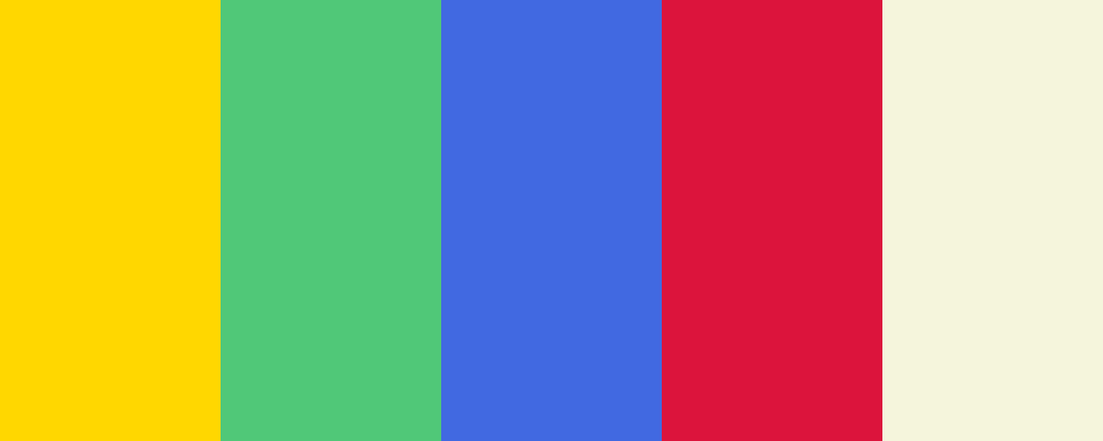
Даний вибір кольорів у палітрі “Щедрість і Багатство” був створений для відображення теми достатку та щедрості. Ось пояснення кожного кольору:
-
Золотистий Жовтий ( #FFD700 ): Цей колір символізує багатство, розкіш і процвітання. Золото асоціюється з успіхом і досягненнями.
-
Смарагдово Зелений ( #50C878 ): Зелений колір часто пов’язують із природою, зростанням і гармонією. Смарагдова відтінок уособлює багатство і фінансову стабільність.
-
Королівський Синій ( #4169E1 ): Цей колір є символом сили, довіри та стабільності. Він надає відчуття впевненості та величі.
-
Карміново Червоний ( #DC143C ): Червоний колір асоціюється з енергією, пристрастю та впливом. Карміновий відтінок надає динамічності та емоційності.
-
Теплий Бежевий ( #F5F5DC ): Цей нейтральний колір додає затишку та комфорту, створюючи баланс у палітрі, що підкреслює інші яскраві кольори.
Разом ці кольори створюють гармонійну комбінацію, яка передає відчуття щедрості, тепла та достатку.
Чи є у вас якісь конкретні запитання про цю палітру або її використання в дизайні?
Overview
Welcome back, here's what's happening today.
Revenue Growth
Build something amazing
Create stunning designs with our AI-powered color palette generator. Perfect for web, mobile, and print.
Fast Performance
Optimized for speed and efficiency.
Secure by Default
Enterprise-grade security built-in.
Easy to Use
Intuitive interface for everyone.
Good Morning
Here's your daily update
Today
Logo Variations
Business Card
John Doe
Creative Director
john.doe@brandname.com
+1 (555) 123-4567
www.brandname.com
Type Scale
Heading 1
Bold / 48pxHeading 2
Bold / 36pxHeading 3
Bold / 30pxHeading 4
Bold / 24pxBody text. Lorem ipsum dolor sit amet, consectetur adipiscing elit. Sed do eiusmod tempor incididunt ut labore et dolore magna aliqua.
Regular / 16pxArticle Layout
The Future of Color
Color trends are evolving rapidly. We are seeing a shift towards more vibrant, expressive palettes that capture attention and evoke emotion.
"Color is a power which directly influences the soul."
Why it matters
Choosing the right color palette is crucial for brand identity. It communicates values without words and creates an instant connection with the audience.
Abstract
Composition #01
Download Files
Copy Code
Simulate how your palette appears to users with different types of color vision deficiencies. Approximately 8% of men and 0.5% of women have some form of color blindness.
Original Palette
Protanopia
Red-blind (approx. 1% of men)
Deuteranopia
Green-blind (approx. 1% of men)
Tritanopia
Blue-blind (very rare)
Achromatopsia
Total color blindness (monochromacy)
Shades & Tints
Explore lighter variations (tints) and darker variations (shades) of each color. Click any color to copy its hex code.
Gold
#FFD700
Tints
(Mixed with white - lighter)Original
Shades
(Mixed with black - darker)Seaweed
#50C878
Tints
(Mixed with white - lighter)Original
Shades
(Mixed with black - darker)Bluetiful
#4169E1
Tints
(Mixed with white - lighter)Original
Shades
(Mixed with black - darker)Lollipop
#DC143C
Tints
(Mixed with white - lighter)Original
Shades
(Mixed with black - darker)Praise the Sun
#F5F5DC
Tints
(Mixed with white - lighter)Original
Shades
(Mixed with black - darker)Color Wheel Distribution
Harmony Analysis
Dominant Temperature
--
Harmony Type
--
Analyzing color relationships...
Color Values (HSL)
Select Background
Select Text Color
Contrast Analysis
Aa
The quick brown fox jumps over the lazy dog.
Normal Text
Large Text
Understanding WCAG Scores
Normal Text
- AA requires 4.5:1 ratio
- AAA requires 7.0:1 ratio
Large Text (18pt+ or 14pt+ bold)
- AA requires 3.0:1 ratio
- AAA requires 4.5:1 ratio