

Колобок
About This Color Palette
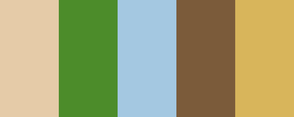
Я обрав цю кольорову палітру, щоб відобразити основні елементи та атмосферу казки про Колобка. Ось пояснення кожного кольору:
-
Golden Bread ( #D8B55B ) - Цей колір символізує сам Колобок, золотистий і рум’яний, що нагадує про свіжий хліб, випечений з любов’ю.
-
Warm Wheat ( #E5CBA8 ) - Теплий відтінок пшениці асоціюється з полями, де вирощується зерно, із якого роблять хліб. Він додає відчуття затишку та домашнього тепла.
-
Forest Green ( #4C8C2A ) - Цей відтінок зеленого нагадує про ліси та природу, з якою стикається Колобок у своїх подорожах. Він символізує життя і свіжість.
-
Sky Blue ( #A4C8E1 ) - Блакитний колір неба представляє безкрайні небесні простори і вільний дух Колобка, який мандрує по світу.
-
Earthy Brown ( #7B5B3A ) - Земляний коричневий колір символізує зв’язок з природою і землю, на якій росте пшениця, а також нагадує про старі традиції та сільське життя.
Ця палітра намагається передати атмосферу казки, її теплоту та природні елементи, які оточують персонажа. Чи є ще щось, що вас цікавить про кольори або їх використання?
Overview
Welcome back, here's what's happening today.
Revenue Growth
Build something amazing
Create stunning designs with our AI-powered color palette generator. Perfect for web, mobile, and print.
Fast Performance
Optimized for speed and efficiency.
Secure by Default
Enterprise-grade security built-in.
Easy to Use
Intuitive interface for everyone.
Good Morning
Here's your daily update
Today
Logo Variations
Business Card
John Doe
Creative Director
john.doe@brandname.com
+1 (555) 123-4567
www.brandname.com
Type Scale
Heading 1
Bold / 48pxHeading 2
Bold / 36pxHeading 3
Bold / 30pxHeading 4
Bold / 24pxBody text. Lorem ipsum dolor sit amet, consectetur adipiscing elit. Sed do eiusmod tempor incididunt ut labore et dolore magna aliqua.
Regular / 16pxArticle Layout
The Future of Color
Color trends are evolving rapidly. We are seeing a shift towards more vibrant, expressive palettes that capture attention and evoke emotion.
"Color is a power which directly influences the soul."
Why it matters
Choosing the right color palette is crucial for brand identity. It communicates values without words and creates an instant connection with the audience.
Abstract
Composition #01
Download Files
Copy Code
Simulate how your palette appears to users with different types of color vision deficiencies. Approximately 8% of men and 0.5% of women have some form of color blindness.
Original Palette
Protanopia
Red-blind (approx. 1% of men)
Deuteranopia
Green-blind (approx. 1% of men)
Tritanopia
Blue-blind (very rare)
Achromatopsia
Total color blindness (monochromacy)
Shades & Tints
Explore lighter variations (tints) and darker variations (shades) of each color. Click any color to copy its hex code.
Gourmet Honey
#E5CBA8
Tints
(Mixed with white - lighter)Original
Shades
(Mixed with black - darker)La Palma
#4C8C2A
Tints
(Mixed with white - lighter)Original
Shades
(Mixed with black - darker)Metal Gear
#A4C8E1
Tints
(Mixed with white - lighter)Original
Shades
(Mixed with black - darker)Cold Brew Coffee
#7B5B3A
Tints
(Mixed with white - lighter)Original
Shades
(Mixed with black - darker)Luxurious
#D8B55B
Tints
(Mixed with white - lighter)Original
Shades
(Mixed with black - darker)Color Wheel Distribution
Harmony Analysis
Dominant Temperature
--
Harmony Type
--
Analyzing color relationships...
Color Values (HSL)
Select Background
Select Text Color
Contrast Analysis
Aa
The quick brown fox jumps over the lazy dog.
Normal Text
Large Text
Understanding WCAG Scores
Normal Text
- AA requires 4.5:1 ratio
- AAA requires 7.0:1 ratio
Large Text (18pt+ or 14pt+ bold)
- AA requires 3.0:1 ratio
- AAA requires 4.5:1 ratio