

Diverse World
About This Color Palette
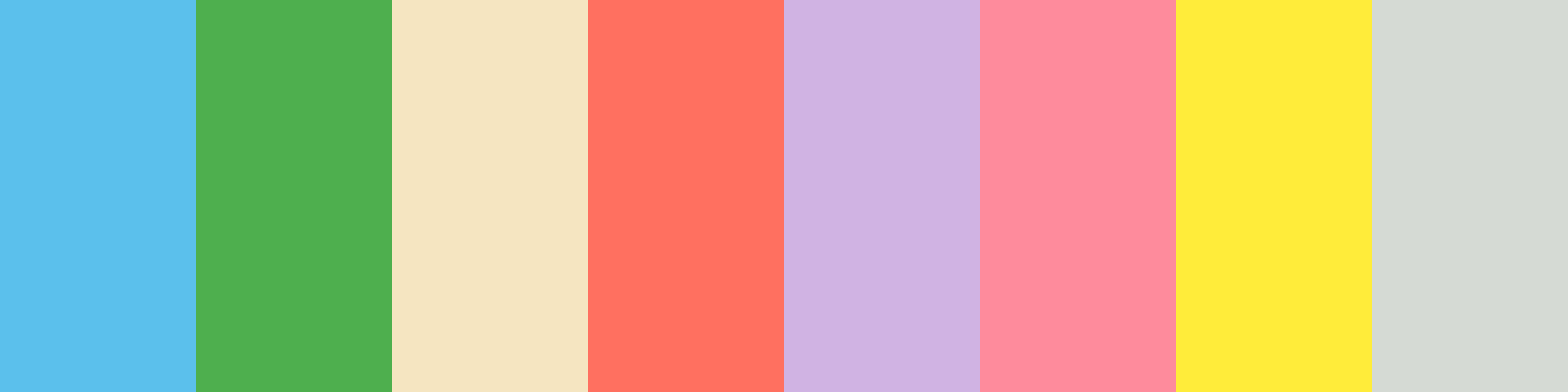
Sure! Here’s a new color palette featuring eight distinct and inviting colors, including a calming blue for the oceans and colors representing each continent. This palette is designed to be vibrant yet friendly for autistic children.
json
{
  "palette_name": "Diverse World",
  "colors": [
    {
      "name": "Ocean Blue",
      "hex_code": "

                            #5BC0EB
                        "  // Oceans
    },
    {
      "name": "Lush Green",
      "hex_code": "

                            #4CAF50
                        "  // Africa
    },
    {
      "name": "Soft Beige",
      "hex_code": "

                            #F5E6C1
                        "  // Asia
    },
    {
      "name": "Pastel Coral",
      "hex_code": "

                            #FF6F61
                        "  // Australia
    },
    {
      "name": "Sky Lavender",
      "hex_code": "

                            #D1B2E2
                        "  // Europe
    },
    {
      "name": "Bright Salmon",
      "hex_code": "

                            #FF8C9A
                        "  // North America
    },
    {
      "name": "Sunny Yellow",
      "hex_code": "

                            #FFEB3B
                        "  // South America
    },
    {
      "name": "Warm Gray",
      "hex_code": "

                            #D7D9D7
                        "  // Antarctica
    }
  ]
}
Palette Description
- Ocean Blue: A bright and inviting color representing the oceans.
- Lush Green: A vibrant green for Africa, symbolizing its rich flora and fauna.
- Soft Beige: A warm and neutral tone for Asia, providing a calm backdrop.
- Pastel Coral: A cheerful coral for Australia, exuding warmth and friendliness.
- Sky Lavender: A gentle lilac for Europe, maintaining a soothing aesthetic.
- Bright Salmon: An engaging and warm color for North America, representing diversity.
- Sunny Yellow: A vibrant yellow for South America, embodying happiness and energy.
- Warm Gray: A soft gray for Antarctica, providing a neutral and calming presence.
Considerations for Use
- This palette features a combination of vibrant colors while maintaining a friendly and gentle appearance suitable for children.
- Each color corresponds to a continent or region, ensuring clarity and distinction while remaining visually appealing.
Would you like to make any adjustments or explore additional options?
Overview
Welcome back, here's what's happening today.
Revenue Growth
Build something amazing
Create stunning designs with our AI-powered color palette generator. Perfect for web, mobile, and print.
Fast Performance
Optimized for speed and efficiency.
Secure by Default
Enterprise-grade security built-in.
Easy to Use
Intuitive interface for everyone.
Good Morning
Here's your daily update
Today
Logo Variations
Business Card
John Doe
Creative Director
john.doe@brandname.com
+1 (555) 123-4567
www.brandname.com
Type Scale
Heading 1
Bold / 48pxHeading 2
Bold / 36pxHeading 3
Bold / 30pxHeading 4
Bold / 24pxBody text. Lorem ipsum dolor sit amet, consectetur adipiscing elit. Sed do eiusmod tempor incididunt ut labore et dolore magna aliqua.
Regular / 16pxArticle Layout
The Future of Color
Color trends are evolving rapidly. We are seeing a shift towards more vibrant, expressive palettes that capture attention and evoke emotion.
"Color is a power which directly influences the soul."
Why it matters
Choosing the right color palette is crucial for brand identity. It communicates values without words and creates an instant connection with the audience.
Abstract
Composition #01
Download Files
Copy Code
Simulate how your palette appears to users with different types of color vision deficiencies. Approximately 8% of men and 0.5% of women have some form of color blindness.
Original Palette
Protanopia
Red-blind (approx. 1% of men)
Deuteranopia
Green-blind (approx. 1% of men)
Tritanopia
Blue-blind (very rare)
Achromatopsia
Total color blindness (monochromacy)
Shades & Tints
Explore lighter variations (tints) and darker variations (shades) of each color. Click any color to copy its hex code.
Ocean Blue
#5BC0EB
Tints
(Mixed with white - lighter)Original
Shades
(Mixed with black - darker)Lush Green
#4CAF50
Tints
(Mixed with white - lighter)Original
Shades
(Mixed with black - darker)Soft Beige
#F5E6C1
Tints
(Mixed with white - lighter)Original
Shades
(Mixed with black - darker)Pastel Coral
#FF6F61
Tints
(Mixed with white - lighter)Original
Shades
(Mixed with black - darker)Sky Lavender
#D1B2E2
Tints
(Mixed with white - lighter)Original
Shades
(Mixed with black - darker)Bright Salmon
#FF8C9A
Tints
(Mixed with white - lighter)Original
Shades
(Mixed with black - darker)Sunny Yellow
#FFEB3B
Tints
(Mixed with white - lighter)Original
Shades
(Mixed with black - darker)Warm Gray
#D7D9D7
Tints
(Mixed with white - lighter)Original
Shades
(Mixed with black - darker)Color Wheel Distribution
Harmony Analysis
Dominant Temperature
--
Harmony Type
--
Analyzing color relationships...
Color Values (HSL)
Select Background
Select Text Color
Contrast Analysis
Aa
The quick brown fox jumps over the lazy dog.
Normal Text
Large Text
Understanding WCAG Scores
Normal Text
- AA requires 4.5:1 ratio
- AAA requires 7.0:1 ratio
Large Text (18pt+ or 14pt+ bold)
- AA requires 3.0:1 ratio
- AAA requires 4.5:1 ratio