

I Need A Colour Palette That Feels Calming And Bold At The Same Time, If That Is At All Possible.
About This Color Palette
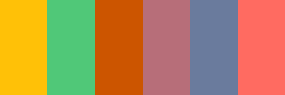
Here are several alternative accent colors that would work beautifully with the “Navy Dreams” palette, each bringing a unique vibe:
- Mustard Yellow - A warm and inviting color that adds a pop of cheerfulness.
- Hex Code: #FFC107
- Emerald Green - A rich, vibrant green that brings a touch of luxury and nature.
- Hex Code: #50C878
- Burnt Orange - A warm, earthy tone that adds energy without overwhelming.
- Hex Code: #CC5500
- Rose Gold - A soft metallic hue that adds a modern and elegant touch.
- Hex Code: #B76E79
- Slate Blue - A muted blue with a hint of gray, providing a calming contrast.
- Hex Code: #6A7B9D
- Deep Coral - A vibrant coral that adds a lively and fresh element to the palette.
- Hex Code: #FF6B61
Let me know if you’d like to create a new palette using one of these accent colors, or if you have another idea in mind!
Customize Preview Colors
Upgrade to ProOverview
Welcome back, here's what's happening today.
Revenue Growth
Build something amazing
Create stunning designs with our AI-powered color palette generator. Perfect for web, mobile, and print.
Fast Performance
Optimized for speed and efficiency.
Secure by Default
Enterprise-grade security built-in.
Easy to Use
Intuitive interface for everyone.
Good Morning
Here's your daily update
Today
Logo Variations
Business Card
John Doe
Creative Director
john.doe@brandname.com
+1 (555) 123-4567
www.brandname.com
Type Scale
Heading 1
Bold / 48pxHeading 2
Bold / 36pxHeading 3 Bold / 30px
Heading 4
Bold / 24pxBody text. Lorem ipsum dolor sit amet, consectetur adipiscing elit. Sed do eiusmod tempor incididunt ut labore et dolore magna aliqua.
Regular / 16pxArticle Layout
The Future of Color
Color trends are evolving rapidly. We are seeing a shift towards more vibrant, expressive palettes that capture attention and evoke emotion.
"Color is a power which directly influences the soul."
Why it matters
Choosing the right color palette is crucial for brand identity. It communicates values without words and creates an instant connection with the audience.
Abstract
Composition #01
Download Files
Copy Code
Simulate how your palette appears to users with different types of color vision deficiencies. Approximately 8% of men and 0.5% of women have some form of color blindness.
Original Palette
Protanopia
Red-blind (approx. 1% of men)
Deuteranopia
Green-blind (approx. 1% of men)
Tritanopia
Blue-blind (very rare)
Achromatopsia
Total color blindness (monochromacy)
Shades & Tints
Explore lighter variations (tints) and darker variations (shades) of each color. Click any color to copy its hex code.
Marigold
#FFC107
Tints
(Mixed with white - lighter)Original
Shades
(Mixed with black - darker)Seaweed
#50C878
Tints
(Mixed with white - lighter)Original
Shades
(Mixed with black - darker)Dark Orange
#CC5500
Tints
(Mixed with white - lighter)Original
Shades
(Mixed with black - darker)Watermelon Gelato
#B76E79
Tints
(Mixed with white - lighter)Original
Shades
(Mixed with black - darker)Misty Harbor
#6A7B9D
Tints
(Mixed with white - lighter)Original
Shades
(Mixed with black - darker)Pastel Red
#FF6B61
Tints
(Mixed with white - lighter)Original
Shades
(Mixed with black - darker)Color Theory Analysis
Unlock advanced color wheel distribution, harmony detection, and HSL color analysis with Pro.
Upgrade to ProColor Wheel Distribution
Harmony Analysis
Dominant Temperature
--
Harmony Type
--
Analyzing color relationships...
Color Values (HSL)
Select Background
Select Text Color
Contrast Analysis
Aa
The quick brown fox jumps over the lazy dog.
Normal Text
Large Text
Understanding WCAG Scores
Normal Text
- AA requires 4.5:1 ratio
- AAA requires 7.0:1 ratio
Large Text (18pt+ or 14pt+ bold)
- AA requires 3.0:1 ratio
- AAA requires 4.5:1 ratio