

Game Of Thrones Updated
About This Color Palette
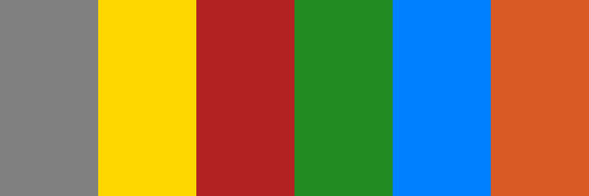
Here’s the updated color palette with “Night’s Watch Black” removed and replaced with a different color while maintaining the overall theme.
json
{
  "palette_name": "Game of Thrones Updated",
  "colors": [
    {
      "name": "Stark Grey",
      "hex_code": "

          #808080
       "
    },
    {
      "name": "Lannister Gold",
      "hex_code": "

          #FFD700
       "
    },
    {
      "name": "Targaryen Red",
      "hex_code": "

          #B22222
       "
    },
    {
      "name": "Tyrell Green",
      "hex_code": "

          #228B22
       "
    },
    {
      "name": "Tully Blue",
      "hex_code": "

          #007FFF
       "
    },
    {
      "name": "Martell Orange",
      "hex_code": "

          #D95A25
       "
    }
  ]
}
Palette Description
This updated “Game of Thrones” palette now features “Martell Orange,” which represents House Martell’s vibrant and warm colors, replacing the previous “Night’s Watch Black.” This palette continues to embody the spirit of the series, highlighting the alliances and unique traits of each house.
Is there anything else you’d like to adjust or add to this palette?
Customize Preview Colors
Upgrade to ProOverview
Welcome back, here's what's happening today.
Revenue Growth
Build something amazing
Create stunning designs with our AI-powered color palette generator. Perfect for web, mobile, and print.
Fast Performance
Optimized for speed and efficiency.
Secure by Default
Enterprise-grade security built-in.
Easy to Use
Intuitive interface for everyone.
Good Morning
Here's your daily update
Today
Logo Variations
Business Card
John Doe
Creative Director
john.doe@brandname.com
+1 (555) 123-4567
www.brandname.com
Type Scale
Heading 1
Bold / 48pxHeading 2
Bold / 36pxHeading 3 Bold / 30px
Heading 4
Bold / 24pxBody text. Lorem ipsum dolor sit amet, consectetur adipiscing elit. Sed do eiusmod tempor incididunt ut labore et dolore magna aliqua.
Regular / 16pxArticle Layout
The Future of Color
Color trends are evolving rapidly. We are seeing a shift towards more vibrant, expressive palettes that capture attention and evoke emotion.
"Color is a power which directly influences the soul."
Why it matters
Choosing the right color palette is crucial for brand identity. It communicates values without words and creates an instant connection with the audience.
Abstract
Composition #01
Download Files
Copy Code
Simulate how your palette appears to users with different types of color vision deficiencies. Approximately 8% of men and 0.5% of women have some form of color blindness.
Original Palette
Protanopia
Red-blind (approx. 1% of men)
Deuteranopia
Green-blind (approx. 1% of men)
Tritanopia
Blue-blind (very rare)
Achromatopsia
Total color blindness (monochromacy)
Shades & Tints
Explore lighter variations (tints) and darker variations (shades) of each color. Click any color to copy its hex code.
Stark Grey
#808080
Tints
(Mixed with white - lighter)Original
Shades
(Mixed with black - darker)Lannister Gold
#FFD700
Tints
(Mixed with white - lighter)Original
Shades
(Mixed with black - darker)Targaryen Red
#B22222
Tints
(Mixed with white - lighter)Original
Shades
(Mixed with black - darker)Tyrell Green
#228B22
Tints
(Mixed with white - lighter)Original
Shades
(Mixed with black - darker)Tully Blue
#007FFF
Tints
(Mixed with white - lighter)Original
Shades
(Mixed with black - darker)Martell Orange
#D95A25
Tints
(Mixed with white - lighter)Original
Shades
(Mixed with black - darker)Color Theory Analysis
Unlock advanced color wheel distribution, harmony detection, and HSL color analysis with Pro.
Upgrade to ProColor Wheel Distribution
Harmony Analysis
Dominant Temperature
--
Harmony Type
--
Analyzing color relationships...
Color Values (HSL)
Select Background
Select Text Color
Contrast Analysis
Aa
The quick brown fox jumps over the lazy dog.
Normal Text
Large Text
Understanding WCAG Scores
Normal Text
- AA requires 4.5:1 ratio
- AAA requires 7.0:1 ratio
Large Text (18pt+ or 14pt+ bold)
- AA requires 3.0:1 ratio
- AAA requires 4.5:1 ratio